Self critique #1: cheetah
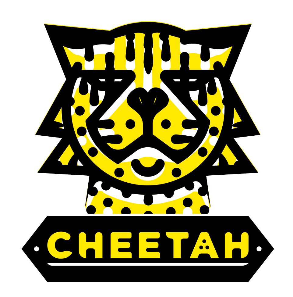
Ok Michael. Our clients looking at these to finished logo's you presented side-by-side and we have some concerns and we also have some compliments. The one on the left is very aggressive, futuristic, and technological. Those are compliments. It’s also very clever when you tell your viewer that it was inspired by the dropbox “open box” logo design…. however, we are losing the cheetah animals reference in all the triangular shapes. One cheetah on the right is exceptional. It’s much more of a cheetah than the left one. The use of yellow and white is very well done and emphasize what animals we’re looking at. The typography that reads “cheetah” is also boldly done like the animal above it…..however… your client is worried about scaling issues. In the smaller versions of the logo, your client is concerned they can’t tell it’s a cheetah anymore, it’s FEELS more like a tiger! The pupils of the eyes disappear at this size.
We feel that for the left one, you need fewer shapes and emphasize the dropbox “open box” shape.
On the right, you need to fix the eyes, less stripes, and make is feel like a cheetah from all sizes.
Please and thank you,
Your imaginary client
P.S. You’re Amazing! XOXO ;)